

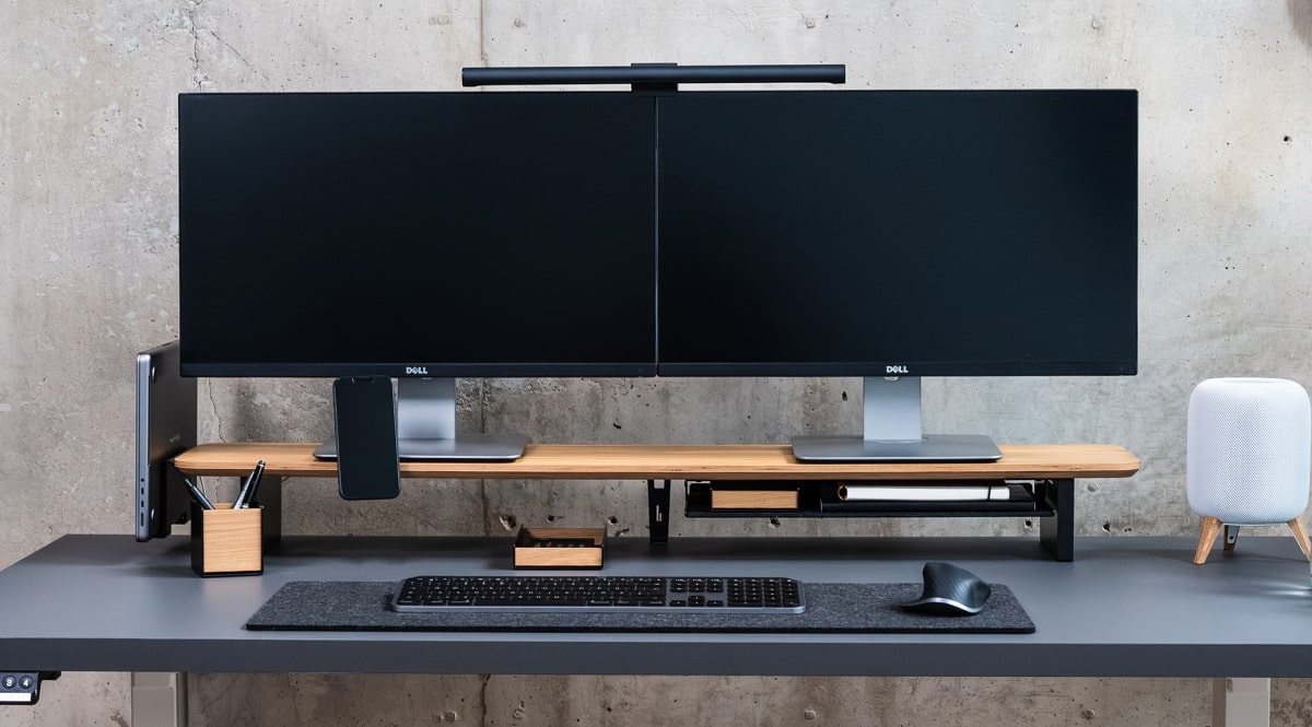
Onepager - t
<html lang="en"><head><meta charset="utf-8" /><meta name="viewport" content="width=device-width, initial-scale=1, shrink-to-fit=no" /><meta name="description" content="" /><meta name="author" content="" /><title>Landing Page - Start Bootstrap Theme</title><!-- Bootstrap core CSS --> <link href="vendor/bootstrap/css/bootstrap.min.css" rel="stylesheet" /> <!-- Custom fonts for this template --> <link href="vendor/font-awesome/css/font-awesome.min.css" rel="stylesheet" type="text/css" /> <link href="vendor/simple-line-icons/css/simple-line-icons.css" rel="stylesheet" type="text/css" /> <link href="https://fonts.googleapis.com/css?family=Lato:300,400,700,300italic,400italic,700italic" rel="stylesheet" type="text/css" /> <!-- Custom styles for this template --> <link href="css/landing-page.min.css" rel="stylesheet" /></head><body><!-- Navigation --> <nav class="navbar navbar-light bg-light static-top"> <div class="container"><a class="navbar-brand" href="#">Start Bootstrap</a> <a class="btn btn-primary" href="#">Sign In</a></div> </nav> <!-- Masthead --> <header class="masthead text-white text-center"> <div class="overlay"></div> <div class="container"> <div class="row"> <div class="col-xl-9 mx-auto"> <h1 class="mb-5">Build a landing page for your business or project and generate more leads!</h1> </div> <div class="col-md-10 col-lg-8 col-xl-7 mx-auto"> <form> <div class="form-row"> <div class="col-12 col-md-9 mb-2 mb-md-0"><input type="email" class="form-control form-control-lg" placeholder="Enter your email..." /></div> <div class="col-12 col-md-3"><button type="submit" class="btn btn-block btn-lg btn-primary">Sign up!</button></div> </div> </form> </div> </div> </div> </header> <!-- Icons Grid --> <section class="features-icons bg-light text-center"> <div class="container"> <div class="row"> <div class="col-lg-4"> <div class="features-icons-item mx-auto mb-5 mb-lg-0 mb-lg-3"> <div class="features-icons-icon d-flex"><i class="icon-screen-desktop m-auto text-primary"></i></div> <h3>Fully Responsive</h3> <p class="lead mb-0">This theme will look great on any device, no matter the size!</p> </div> </div> <div class="col-lg-4"> <div class="features-icons-item mx-auto mb-5 mb-lg-0 mb-lg-3"> <div class="features-icons-icon d-flex"><i class="icon-layers m-auto text-primary"></i></div> <h3>Bootstrap 4 Ready</h3> <p class="lead mb-0">Featuring the latest build of the new Bootstrap 4 framework!</p> </div> </div> <div class="col-lg-4"> <div class="features-icons-item mx-auto mb-0 mb-lg-3"> <div class="features-icons-icon d-flex"><i class="icon-check m-auto text-primary"></i></div> <h3>Easy to Use</h3> <p class="lead mb-0">Ready to use with your own content, or customize the source files!</p> </div> </div> </div> </div> </section> <!-- Image Showcases --> <section class="showcase"> <div class="container-fluid p-0"> <div class="row no-gutters"> <div class="col-lg-6 order-lg-2 text-white showcase-img" style="background-image: url('img/bg-showcase-1.jpg');"></div> <div class="col-lg-6 order-lg-1 my-auto showcase-text"> <h2>Fully Responsive Design</h2> <p class="lead mb-0">When you use a theme created by Start Bootstrap, you know that the theme will look great on any device, whether it's a phone, tablet, or desktop the page will behave responsively!</p> </div> </div> <div class="row no-gutters"> <div class="col-lg-6 text-white showcase-img" style="background-image: url('img/bg-showcase-2.jpg');"></div> <div class="col-lg-6 my-auto showcase-text"> <h2>Updated For Bootstrap 4</h2> <p class="lead mb-0">Newly improved, and full of great utility classes, Bootstrap 4 is leading the way in mobile responsive web development! All of the themes on Start Bootstrap are now using Bootstrap 4!</p> </div> </div> <div class="row no-gutters"> <div class="col-lg-6 order-lg-2 text-white showcase-img" style="background-image: url('img/bg-showcase-3.jpg');"></div> <div class="col-lg-6 order-lg-1 my-auto showcase-text"> <h2>Easy to Use & Customize</h2> <p class="lead mb-0">Landing Page is just HTML and CSS with a splash of SCSS for users who demand some deeper customization options. Out of the box, just add your content and images, and your new landing page will be ready to go!</p> </div> </div> </div> </section> <!-- Testimonials --> <section class="testimonials text-center bg-light"> <div class="container"> <h2 class="mb-5">What people are saying...</h2> <div class="row"> <div class="col-lg-4"> <div class="testimonial-item mx-auto mb-5 mb-lg-0"><img class="img-fluid rounded-circle mb-3" src="img/testimonials-1.jpg" alt="" /> <h5>Margaret E.</h5> <p class="font-weight-light mb-0">"This is fantastic! Thanks so much guys!"</p> </div> </div> <div class="col-lg-4"> <div class="testimonial-item mx-auto mb-5 mb-lg-0"><img class="img-fluid rounded-circle mb-3" src="img/testimonials-2.jpg" alt="" /> <h5>Fred S.</h5> <p class="font-weight-light mb-0">"Bootstrap is amazing. I've been using it to create lots of super nice landing pages."</p> </div> </div> <div class="col-lg-4"> <div class="testimonial-item mx-auto mb-5 mb-lg-0"><img class="img-fluid rounded-circle mb-3" src="img/testimonials-3.jpg" alt="" /> <h5>Sarah W.</h5> <p class="font-weight-light mb-0">"Thanks so much for making these free resources available to us!"</p> </div> </div> </div> </div> </section> <!-- Call to Action --> <section class="call-to-action text-white text-center"> <div class="overlay"></div> <div class="container"> <div class="row"> <div class="col-xl-9 mx-auto"> <h2 class="mb-4">Ready to get started? Sign up now!</h2> </div> <div class="col-md-10 col-lg-8 col-xl-7 mx-auto"> <form> <div class="form-row"> <div class="col-12 col-md-9 mb-2 mb-md-0"><input type="email" class="form-control form-control-lg" placeholder="Enter your email..." /></div> <div class="col-12 col-md-3"><button type="submit" class="btn btn-block btn-lg btn-primary">Sign up!</button></div> </div> </form> </div> </div> </div> </section> <!-- Footer --> <footer class="footer bg-light"> <div class="container"> <div class="row"> <div class="col-lg-6 h-100 text-center text-lg-left my-auto"> <ul class="list-inline mb-2"> <li class="list-inline-item"><a href="#">About</a></li> <li class="list-inline-item">⋅</li> <li class="list-inline-item"><a href="#">Contact</a></li> <li class="list-inline-item">⋅</li> <li class="list-inline-item"><a href="#">Terms of Use</a></li> <li class="list-inline-item">⋅</li> <li class="list-inline-item"><a href="#">Privacy Policy</a></li> </ul> <p class="text-muted small mb-4 mb-lg-0">© Your Website 2018. All Rights Reserved.</p> </div> <div class="col-lg-6 h-100 text-center text-lg-right my-auto"> <ul class="list-inline mb-0"> <li class="list-inline-item mr-3"><a href="#"> <i class="fa fa-facebook fa-2x fa-fw"></i> </a></li> <li class="list-inline-item mr-3"><a href="#"> <i class="fa fa-twitter fa-2x fa-fw"></i> </a></li> <li class="list-inline-item"><a href="#"> <i class="fa fa-instagram fa-2x fa-fw"></i> </a></li> </ul> </div> </div> </div> </footer> <!-- Bootstrap core JavaScript --><script src="vendor/jquery/jquery.min.js"></script><script src="vendor/bootstrap/js/bootstrap.bundle.min.js"></script></body></html>