


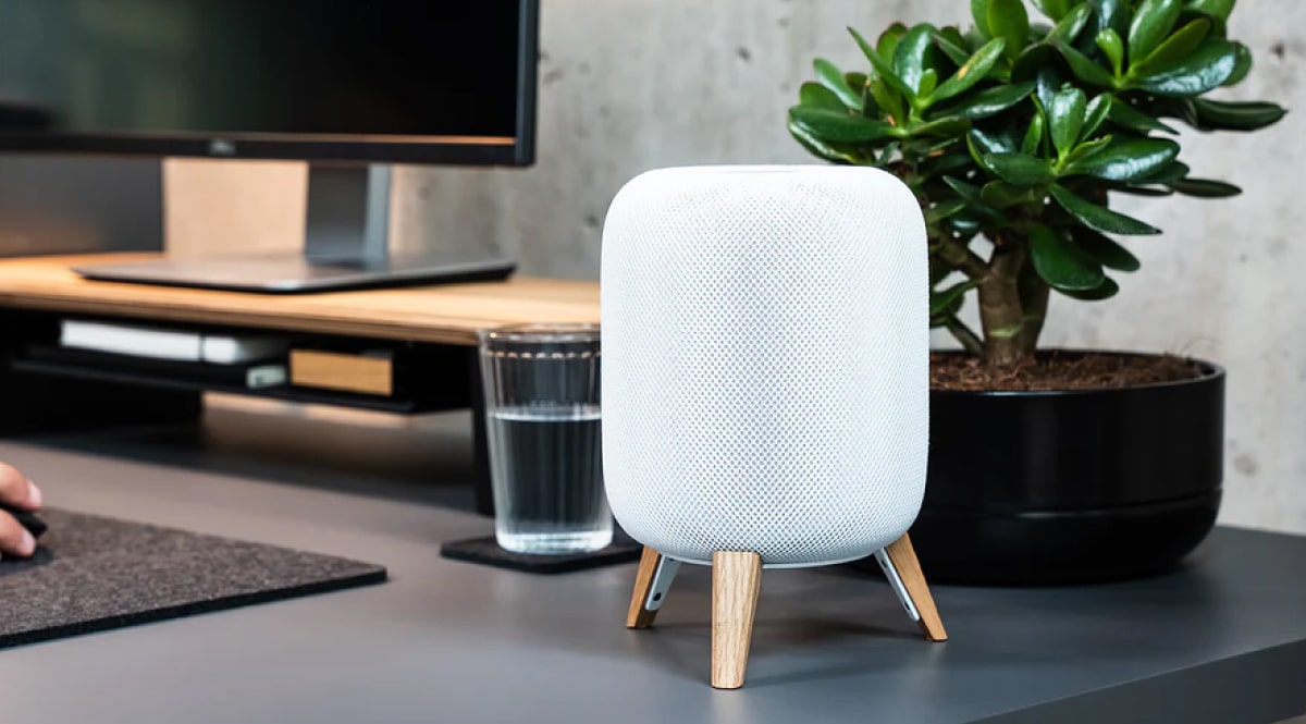

Some desk setups simply look better than others, even when they use similar monitors, keyboards and accessories.
The difference usually isn't the price of the equipment. Good desk setup design comes down to a few basic visual principles: hierarchy, proportion, alignment, repetition, contrast, negative space and visual consistency.
Once you understand these principles, creating an aesthetic desk setup becomes much less about buying more things and much more about arranging what you already have with intention.
Here are seven design principles that can turn an ordinary workspace into a desk setup that feels calm, balanced, and thoughtfully designed.
The 7 Principles of Good Desk Setup Design
| Design principle | What it improves |
| Visual hierarchy | Gives the eye a clear focal point |
| Proportion and scale | Makes objects feel balanced together |
| Alignment | Creates structure and visual order |
| Repetition | Makes the setup feel cohesive |
| Contrast | Adds depth and visual interest |
| Negative space | Makes the desk feel calmer and cleaner |
| Functional consistency | Connects aesthetics with everyday use |
These principles work together. You don't need to perfect every one of them, but the strongest modern desk setups tend to apply several at the same time.
1. Create a Clear Visual Hierarchy
A well-designed workspace gives your eyes somewhere to look first.
In most desk setups, that focal point is the monitor or monitor area. Everything else should visually support it instead of competing for attention.
Imagine a desk with a large monitor in the center, two speakers, a laptop, three lamps, several decorative objects, charging devices, notebooks and multiple accessories scattered across the surface. Even if every individual object looks good, the overall workspace can feel overwhelming.
There are too many visual priorities.
A stronger desk setup creates a hierarchy:
Primary: monitor or main working area
Secondary: keyboard, mouse, laptop, speakers
Tertiary: lighting, plants, notebooks, decorative objects
The idea isn't that everything needs to be perfectly symmetrical. It simply means that some objects should carry more visual weight than others.
Use elevation to strengthen hierarchy
Height is one of the easiest ways to establish a focal point.
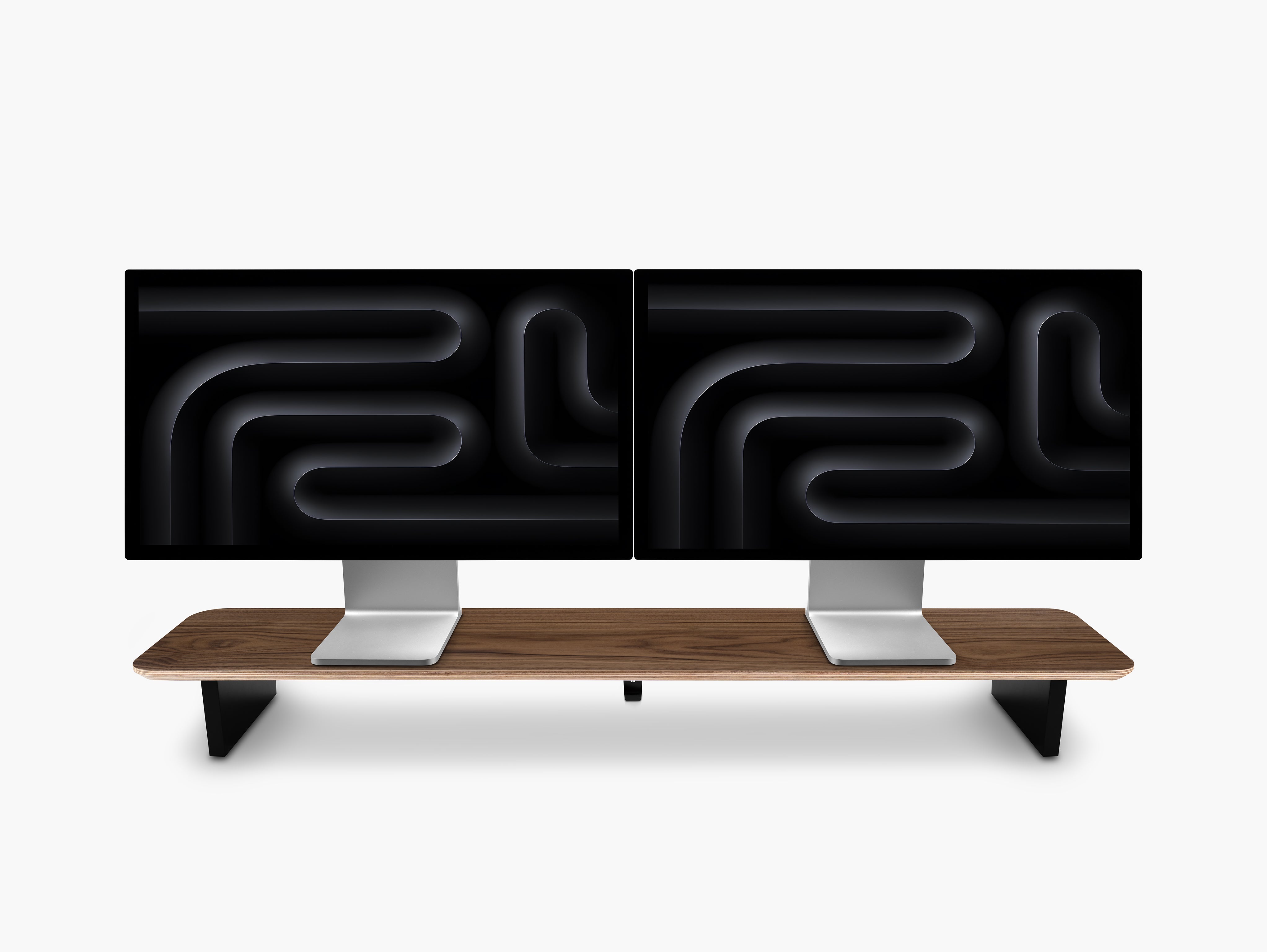
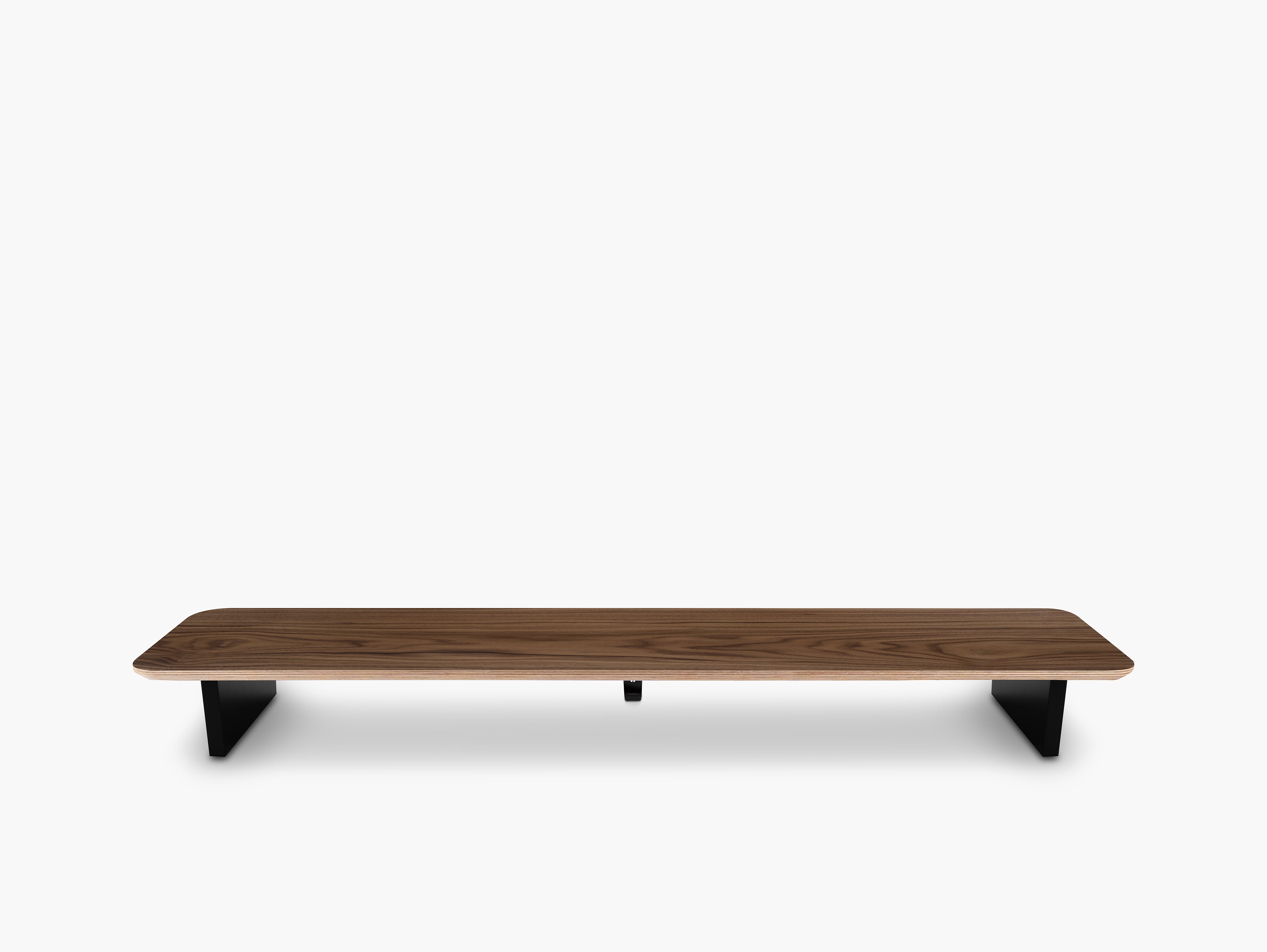
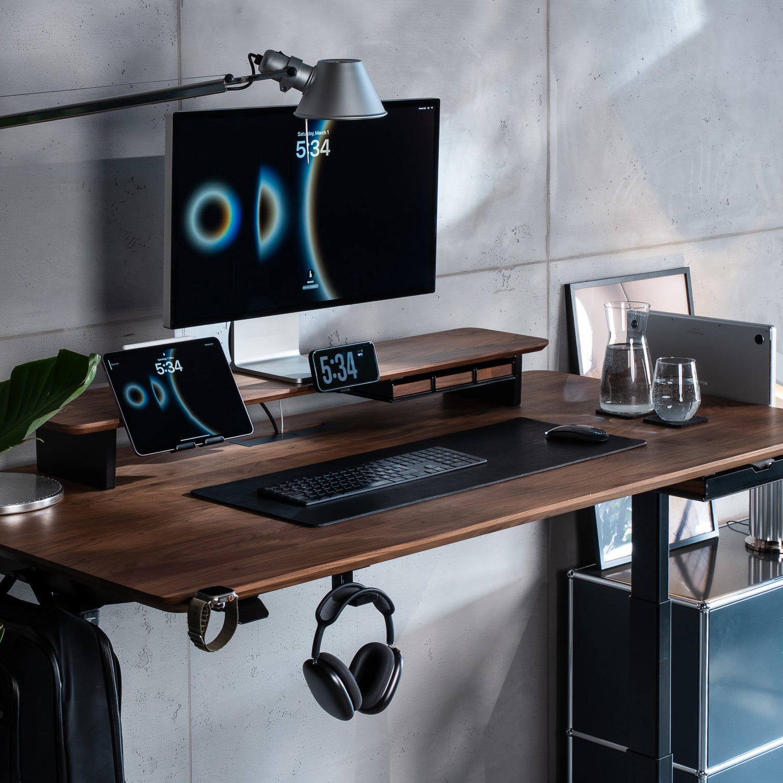
Raising a monitor slightly creates a stronger visual center and introduces another horizontal layer to the workspace. A monitor stand or monitor shelf can therefore affect much more than monitor positioning. It changes the architecture of the entire desk.
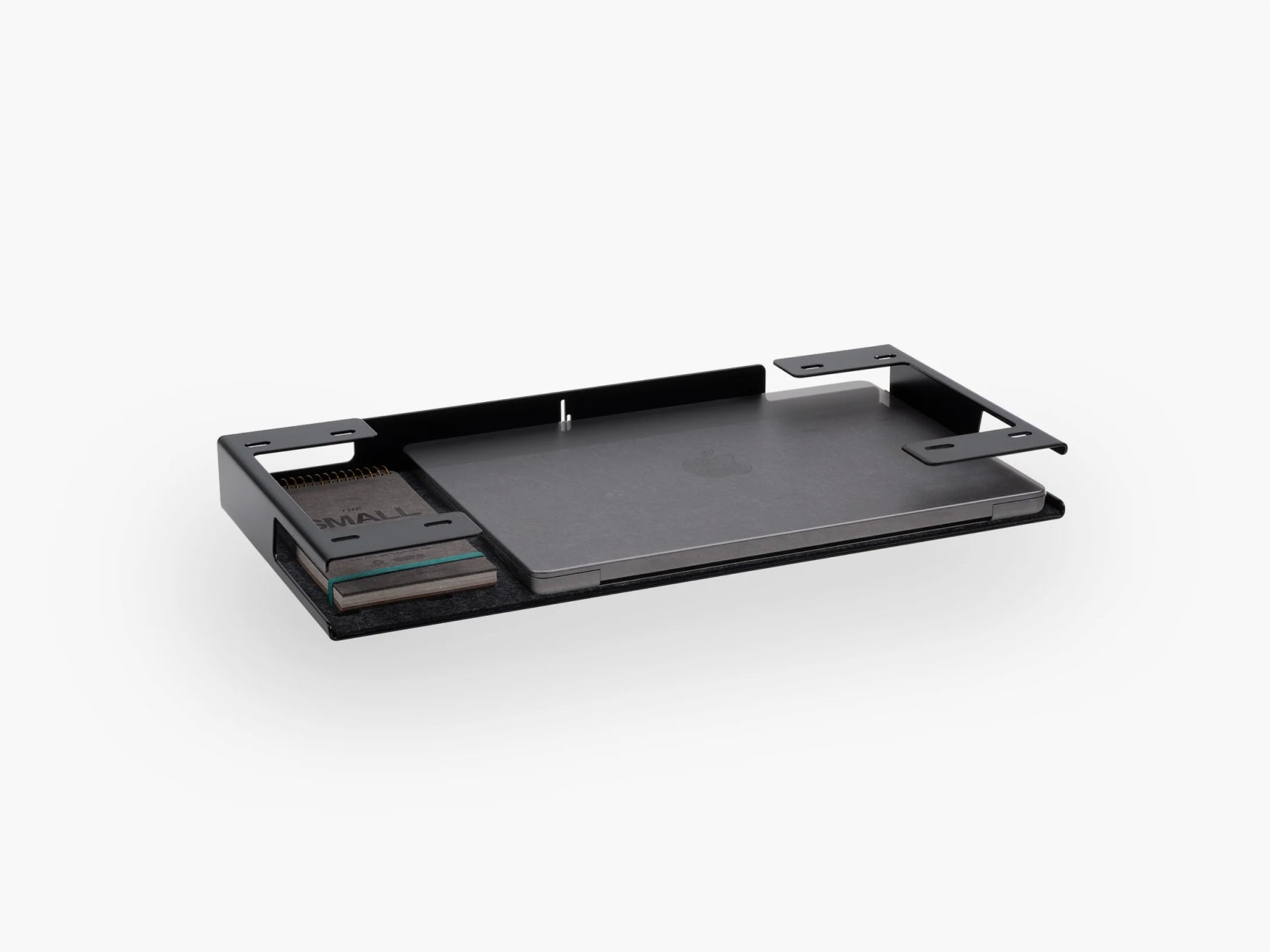
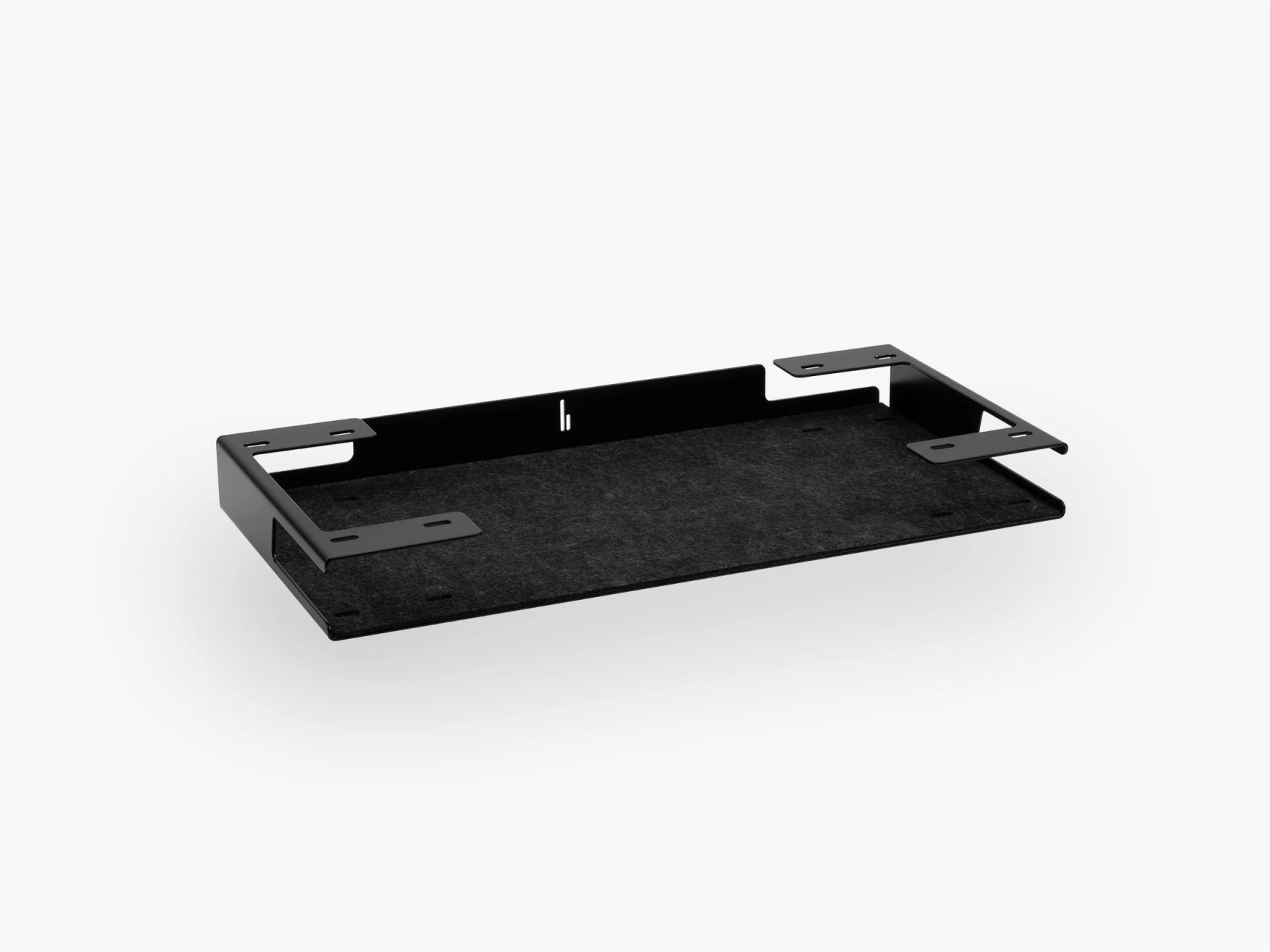
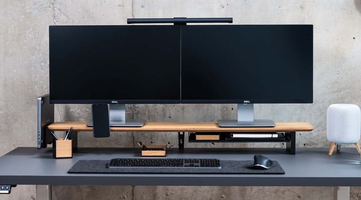
At BALOLO, this idea is central to the Setup Cockpit. The monitor stand forms the main structural layer of the workspace, while compatible accessories can be attached underneath using the modular mounting system. That allows frequently used tools to remain accessible without forcing everything onto the main desk surface.
The result is a clearer hierarchy: screen above, working area below, supporting tools around or underneath it.

2. Pay Attention to Proportion and Scale
One of the most common reasons a desk setup feels visually "off" is incorrect proportion.
A tiny monitor stand beneath a huge ultrawide display can look undersized. An enormous desk mat on a small desk can overpower everything around it. A very small lamp beside a large monitor might appear disconnected from the rest of the setup.
Good desk design considers the size of objects in relation to one another.
Think in relationships, not individual dimensions
Instead of asking:
"Is this accessory too large?"
Ask:
"Does this accessory look appropriately sized compared with everything around it?"
For example, a large monitor generally benefits from other elements with enough visual presence to balance it. That might mean:
- a wider monitor shelf
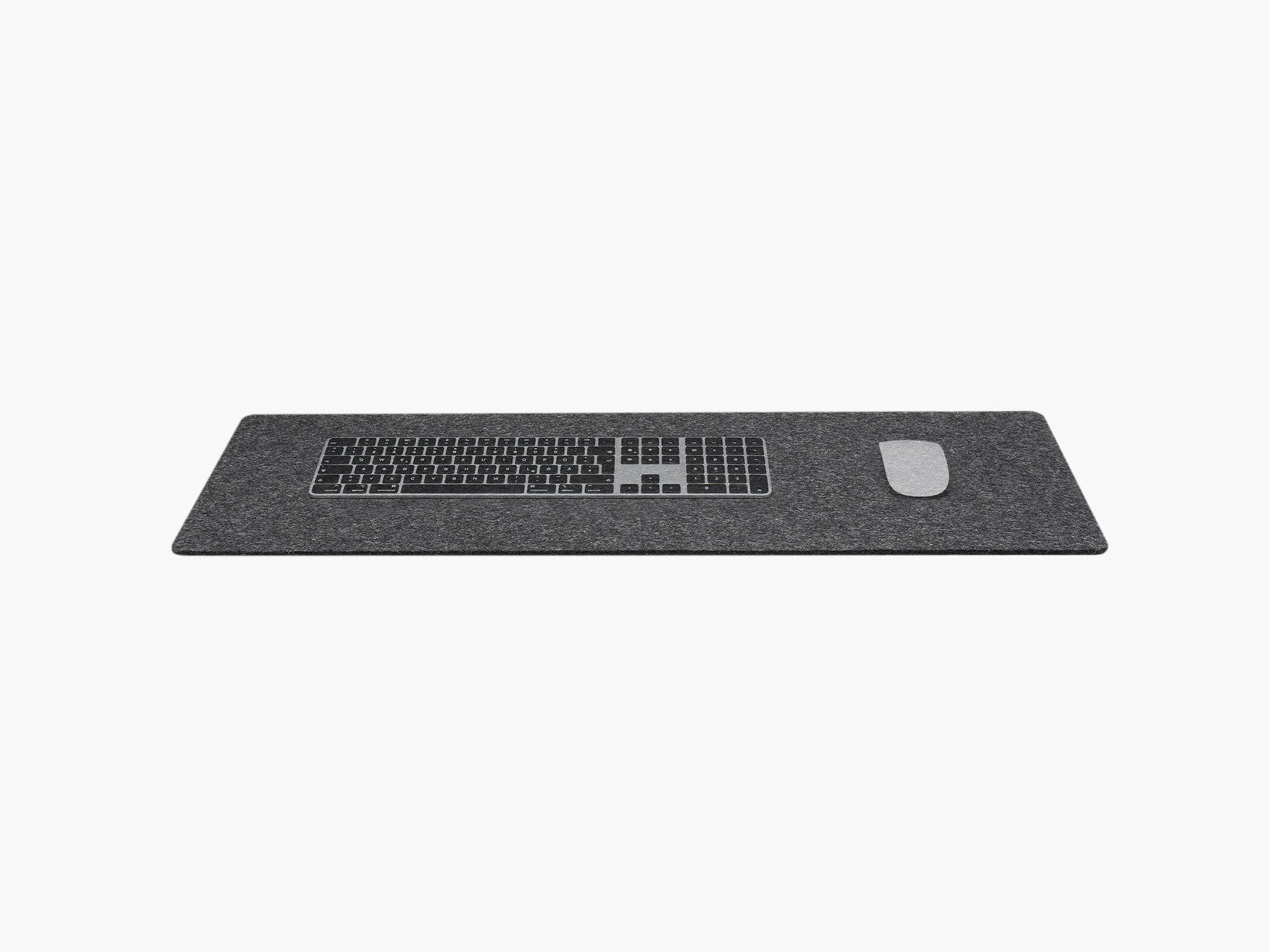
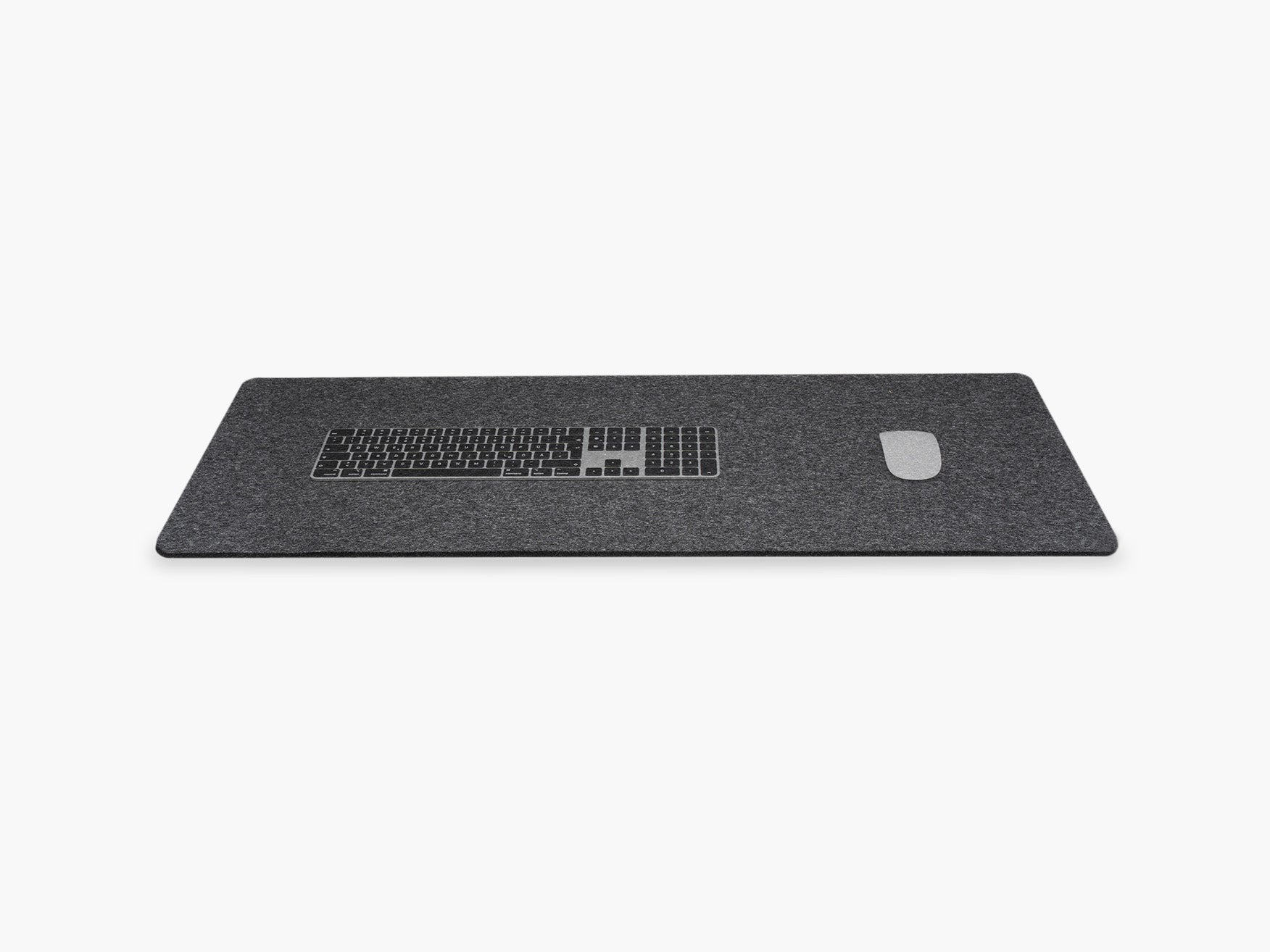
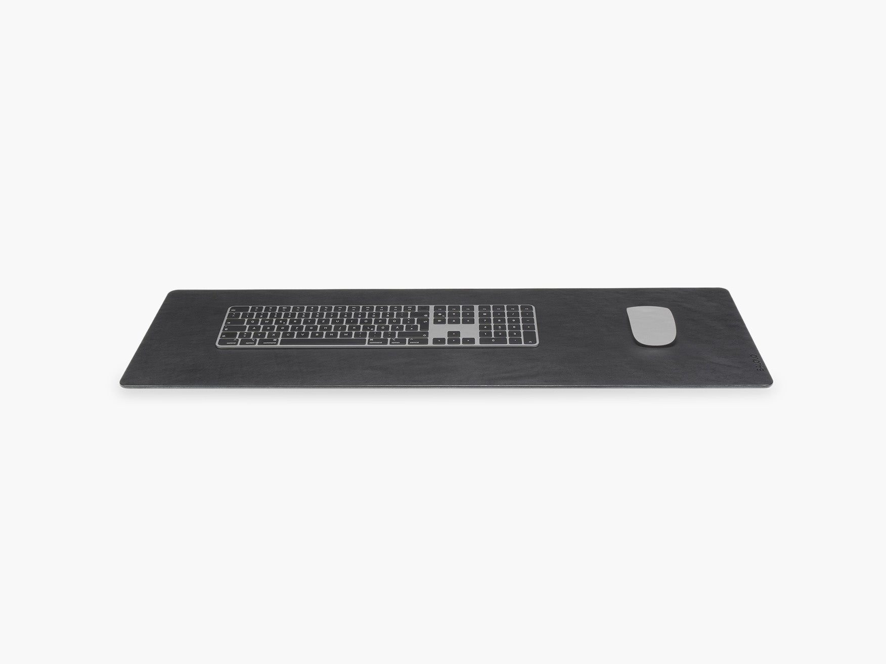
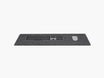
- a substantial desk mat
- medium-sized speakers
- a lamp with enough height
- artwork that relates to the width of the desk
On a compact desk, the opposite approach often works better. Smaller accessories and fewer visual elements keep the workspace from feeling crowded.
Let the desk determine the scale
Start with the largest fixed elements:
- desk
- monitor
- monitor stand or shelf
- keyboard and desk mat
- secondary accessories
- decoration
This order makes it much easier to create balanced desk layout ideas because smaller objects are chosen in response to the major elements rather than independently.
The same principle applies to small home offices. A compact workspace usually looks more refined when every object earns its footprint.
3. Use Alignment to Create Visual Order
Alignment is one of the least noticeable design principles when it works and one of the most noticeable when it doesn't.
Look closely at a particularly clean desk setup and you'll often find invisible lines running through it.
The monitor might align with the middle of the keyboard.
The keyboard may align with the center of the desk pad.
Speakers may sit at equal distances from the monitor.
A monitor shelf may run parallel to the back edge of the desk.
Even smaller objects such as a notebook or phone stand may follow the same horizontal or vertical lines.
That alignment creates visual order.
You don't need perfect symmetry
Alignment and symmetry aren't the same thing.
A desk can be intentionally asymmetrical and still feel balanced.
For example, you might place a lamp and plant on the left while keeping a laptop stand on the right. The objects are different, but their heights, visual weight and distance from the center can still create equilibrium.
This often looks more natural than placing identical objects on both sides.
Start with a center line
If you're struggling with your desk setup layout, begin with one simple reference point: the center of your monitor.
Align your main working tools around it:
monitor
keyboard
mouse or trackpad
desk chair
Then arrange secondary objects around that structure.
Suddenly the workspace has a visual grid, even though nobody can actually see it.

4. Repeat Materials, Colors and Shapes
Professional-looking interiors rarely use completely unrelated materials everywhere.
The same principle applies to a desk.
Repetition creates a sense that the workspace belongs together.
That might mean repeating:
- walnut or oak
- black metal
- aluminum
- warm white
- soft gray
- rounded corners
- matte finishes
You don't have to make every object identical. In fact, doing so can make a workspace feel sterile.
Instead, choose a limited visual vocabulary and repeat it.
Build a simple material palette
A useful starting point is two dominant materials plus one supporting material.
For example:
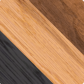
Walnut + black steel + gray textile
Or:
Oak + white metal + aluminum
Or:
Black + dark wood + warm lighting
At BALOLO, we often combine natural wood with powder-coated steel. The contrast between a warm organic surface and precise metal components creates a visual language that can be repeated across a workspace. Our products are manufactured in Germany, with the combination of craftsmanship and modern production playing an important role in the design approach.
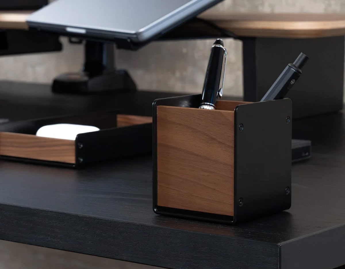
Repetition is why coordinated wooden desk accessories often feel calmer than several individually attractive accessories in unrelated finishes. If you want to go deeper, our guide Material Combinations for Better Workspace Design shows which materials work well together.
Repeat shapes too
Color isn't the only thing you can repeat.
Notice whether the objects on your desk tend to have:
rounded corners
sharp rectangular forms
cylindrical shapes
thin profiles
heavy geometric forms
Repeating these characteristics creates subtle consistency.
You may never consciously notice it. Your brain does.
5. Add Contrast Without Creating Chaos
If everything matches perfectly, a workspace can become flat.
Good modern desk design needs some contrast.
Contrast creates visual interest and gives individual elements definition.
The key is controlled contrast.
Contrast can come from different sources
Color:
A black monitor against a light wall.
Material:
Natural wood beside powder-coated metal.
Texture:
A soft desk pad beneath hard aluminum devices.
Light:
Warm ambient lighting against a darker workspace.
Shape:
A curved lamp beside rectangular screens.
The contrast should reinforce the design rather than introduce another unrelated style.
A minimal workspace doesn't have to mean white walls, white accessories and no decoration. Minimalism is often more effective when a small number of materials are allowed to stand out clearly.
Try the 80/20 approach
An easy way to think about contrast is to let roughly 80 percent of the workspace follow the same visual direction while the remaining 20 percent creates interest.
A dark desk setup might use black and walnut as the dominant palette, then introduce green through one plant.
A light setup might combine white and oak with a few black accents. Not sure which direction suits you? Our article Dark vs Light Desk Setup helps you decide.
The accent becomes more powerful precisely because it is used sparingly.
6. Protect Negative Space
One of the biggest differences between an average desk setup and a refined one is often what isn't on the desk.
Negative space is the empty area surrounding objects.
It gives the eye room to separate one item from another.
Without enough negative space, even premium desk accessories can start looking like clutter.
This is why adding one more accessory doesn't always make an aesthetic desk setup better. Sometimes removing one does.
Empty space is part of the composition
Think of your desk surface as a layout rather than storage.
Every object occupies visual space.
Your keyboard needs space around it.
Your mouse needs room to move.
A lamp benefits from separation from surrounding objects.
Even a decorative piece often looks more intentional when it isn't crowded by five other decorations.
This doesn't mean your desk needs to be empty.
It means empty space should be treated as a design element.
Move functions off the main surface
One of the easiest ways to create negative space is to use vertical and hidden areas more effectively.
Consider:
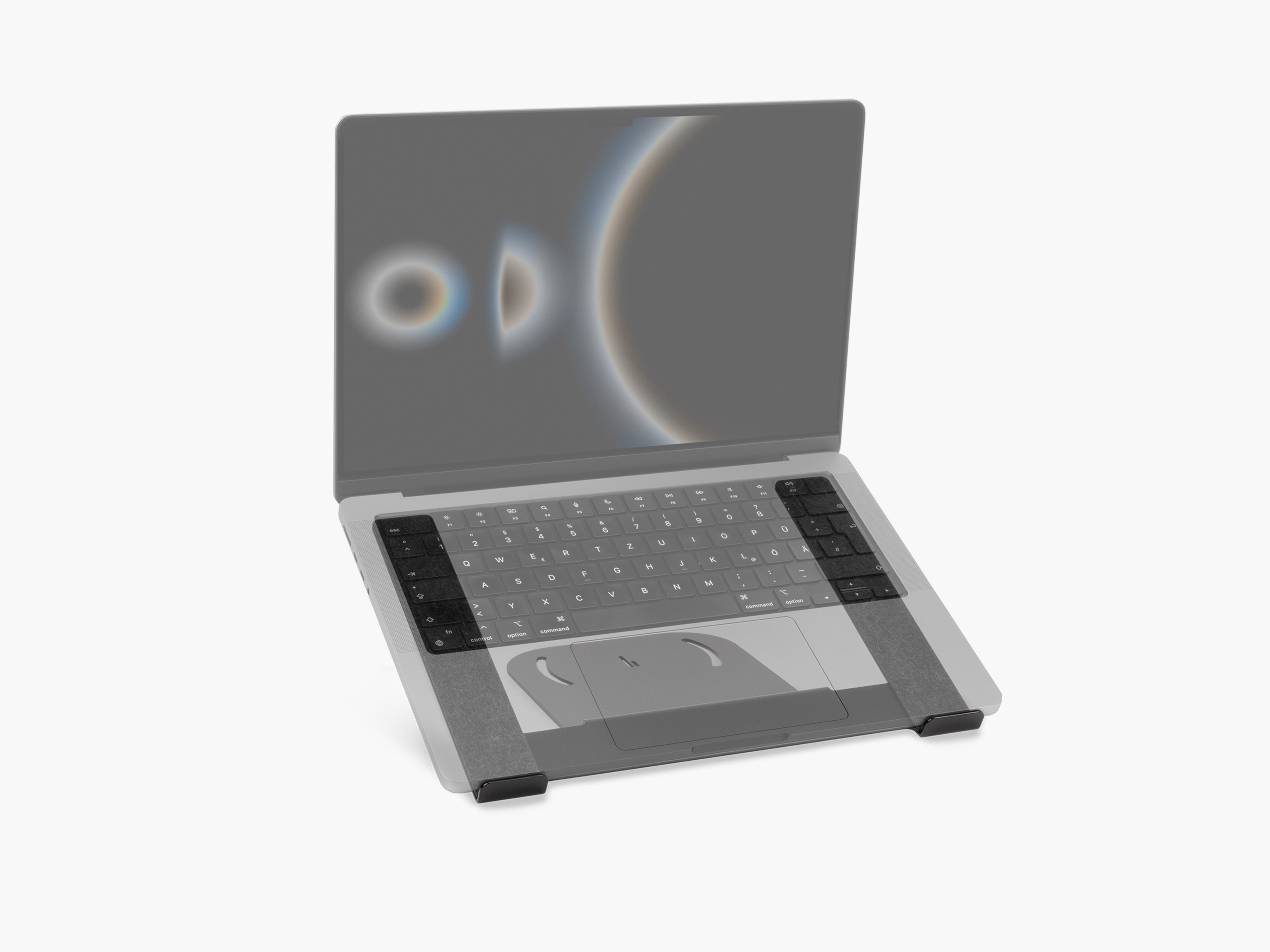
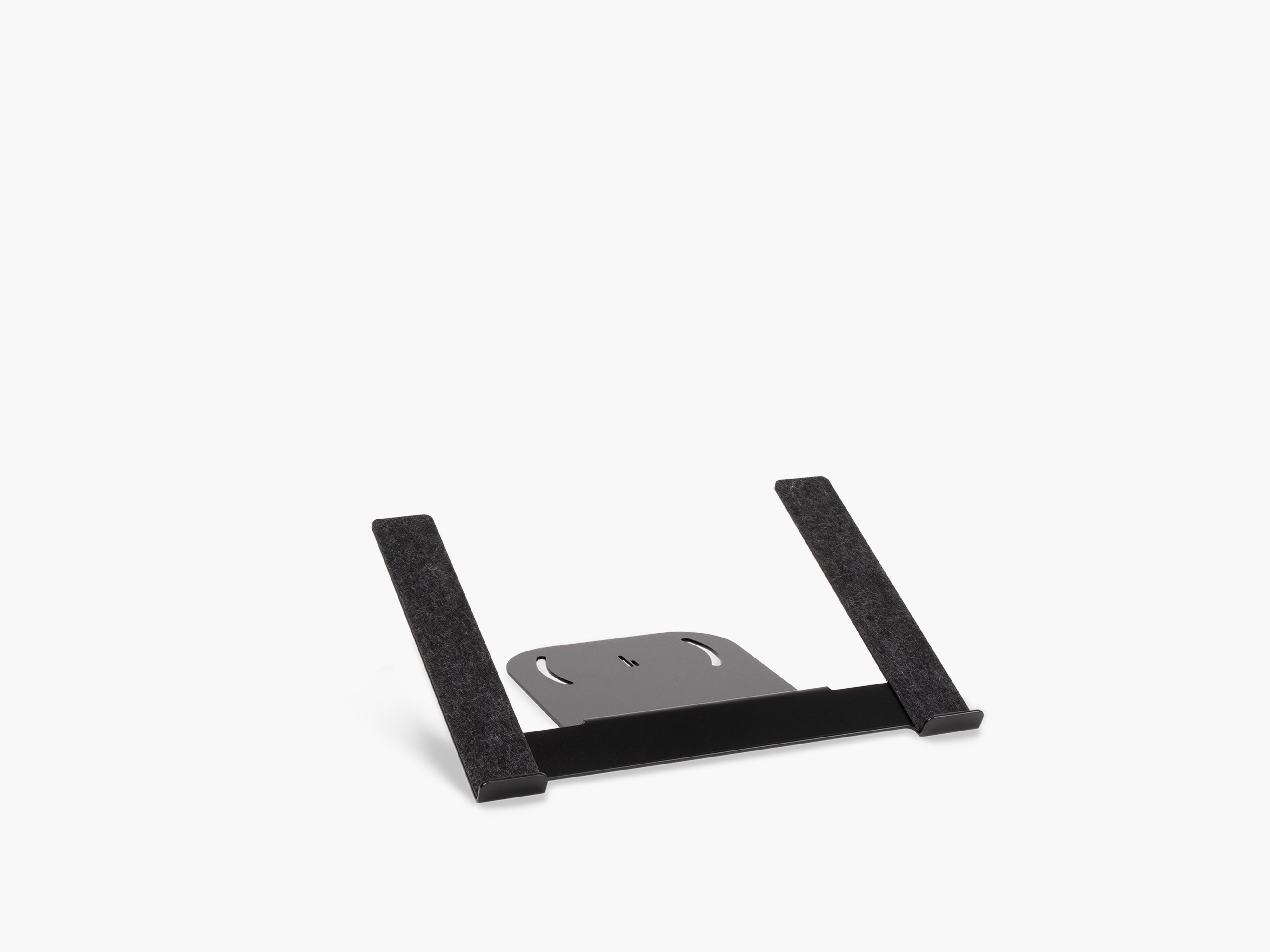
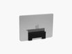
- storing a laptop vertically with the Laptop Dock
- placing accessories beneath a monitor shelf
- mounting headphones with a headphone holder rather than laying them on the desk
- moving power supplies underneath the desk
- routing charging cables away from the work surface
This is one reason modular workspace systems can make a visible difference. The Setup Cockpit, for example, uses an underside mounting grid so compatible accessories can be added without using the same primary surface needed for work.
The goal isn't emptiness.
It's intentional space.

7. Make Function and Aesthetics Follow the Same System
A desk setup can look perfect in a photograph and still be frustrating to use.
And if you're constantly moving cables, shifting accessories or searching for your headphones, the setup probably won't stay beautiful for long.
The strongest workspace design solves aesthetic and functional problems at the same time.
This is the final principle because it connects all the others.
Give frequently used objects a permanent place
Think about the devices you use every day:
phone
laptop
headphones
keyboard
mouse
tablet
charging cable
notebook
Each should have a logical home.
Good desk organization reduces small decisions. Instead of wondering where to put something, the layout answers the question automatically.
That consistency also improves the appearance of the workspace because objects return to the same positions.
Cable management matters more than most accessories
You can spend hours choosing the perfect keyboard, desk pad, monitor and lamp. But if several cables hang behind the desk and power bricks sit across the floor, the setup will still feel unfinished.
Good desk cable management removes visual interruption.
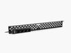
At BALOLO, we treat cable management as part of the overall workspace system rather than a separate afterthought. The current range includes solutions for routing cables beneath the monitor area, like the Cable Organizer, as well as organizing power supplies and connections underneath the desk with the Cable Management System.
Ideally, cables should follow predictable routes and disappear wherever possible. Our guide Desk Cable Management: Which Solution Fits Your Setup? shows which solution fits which situation.
That doesn't only produce a clean desk setup. It makes the workspace easier to maintain.

Why Minimal Desk Setups Often Look So Good
There's a reason minimal desk setup inspiration is so popular.
Minimal setups naturally make several design principles easier to execute.
With fewer objects, there is more negative space.
With fewer materials, repetition becomes stronger.
With fewer competing elements, hierarchy becomes clearer.
And with fewer accessories, alignment is easier to maintain.
But minimalism isn't really about owning the smallest possible number of things.
A good minimal workspace setup removes visual and functional redundancy. We explain how this also boosts focus in How a Minimalist Workspace Improves Your Productivity.
If three products perform essentially the same function, you probably don't need all three visible.
If an accessory isn't used regularly and doesn't meaningfully improve the space, it may be better stored somewhere else.
The result is a workspace where each object has a reason to be there.
How to Improve Your Existing Desk Setup
You don't need to rebuild your workspace from scratch.
Instead, look at it through the seven principles.
First, identify the focal point. In most cases, this should be your primary display.
Then look at proportion. Does one accessory feel unusually large or small?
Check alignment. Are the main objects following a clear structure?
Reduce your color and material palette if too many unrelated finishes compete with one another.
Add a small amount of contrast if the workspace feels flat.
Remove a few objects to create more negative space.
Finally, give cables and frequently used accessories permanent locations.
Often, the biggest improvement comes from rearranging or removing things rather than buying something new.
A Better Desk Setup Is Designed, Not Decorated
It's easy to approach desk decor by asking, "What else should I add?"
A better question is:
What role does each object play in the overall design?
That shift changes everything.
A monitor stand can create hierarchy.
A desk mat can establish proportion.
A lamp can introduce contrast.
A repeated wood finish can create visual consistency.
Cable management can protect negative space.
A laptop holder can improve the layout without adding more objects to the main work surface.
When those decisions support one another, the desk starts to feel intentional.
And that's usually what separates an attractive collection of accessories from a genuinely well-designed workspace.
Frequently Asked Questions
What makes a desk setup look aesthetic?
An aesthetic desk setup usually combines clear visual hierarchy, consistent materials, balanced proportions, alignment, controlled contrast and enough negative space. The goal is visual consistency rather than simply adding decorative accessories.
How can I make my desk setup look more professional?
Start by reducing visible clutter, organizing cables, centering the main working area and limiting your material and color palette. Give frequently used accessories permanent positions so the setup remains organized throughout the day.
What colors work best for a modern desk setup?
There is no single best color scheme. Modern setups often work well with a restrained palette of two or three dominant colors or materials. Popular combinations include oak and white, walnut and black or neutral tones with natural materials.
Does a monitor stand improve desk aesthetics?
A monitor stand can improve desk aesthetics by creating a clear visual hierarchy, introducing another horizontal layer and freeing up usable space underneath the monitor. The effect depends on its scale, material and relationship with the rest of the workspace.
How many accessories should be on a desk?
There is no ideal number. Each visible accessory should either support your workflow or contribute meaningfully to the composition. If removing an object makes the workspace clearer without reducing functionality, it probably doesn't need to remain on the desk.
Is symmetry necessary for a good desk setup?
No. A workspace can be asymmetrical and still look balanced. What matters is the visual weight, scale, spacing and alignment of the objects on each side.
What is the most important desk setup design principle?
Visual hierarchy is a strong place to start because it establishes what the workspace is organized around. However, the best desk setups combine hierarchy with proportion, alignment, material consistency, contrast, negative space and functional organization.